Please enter your email and website or LinkedIn to receive more information about our free and paid accounts.
Please enter your email address below and we’ll send you instructions on how to change your password.
I’ve been lucky enough to work with photographer David Patterson on not one, but two projects within the past year. David initially contacted us last June looking for some feedback on his marketing materials. After reviewing them, our producer Kayleen Kauffman and I recommended that David first focus on updating his branding, and then move on to marketing. David agreed and we started the process with a Logo Design consultation.

As always, I kicked off the project with a few phone calls. At the time, he was primarily working with architectural clients but had begun branching out into more home and garden work. Since he was venturing into new territory, David’s updated logo needed to appeal to new clients while not scaring off his old ones.
Our initial conversations were both productive and fun—always a good sign! David was able to clearly express what direction he wanted to go, and thus, creating concepts was a breeze. I ended up sending over three times as many mockups for consideration than I typically do! David immediately pinpointed which ideas worked, and which could be left behind. Below are some examples of his favorites.

Since he was branching out into new territory, David’s updated logo needed to appeal to new clients while not scaring off his old ones. After several rounds of drafts, David chose his favorite (seen below). The typeface selection was key: using the sans-serif made his logo look more editorial (which would appeal to home and garden publications), but it wasn’t so “out there” that it wouldn’t be appropriate for architecture and commercial clients too. Plus, it looked beautiful next to his pictures.

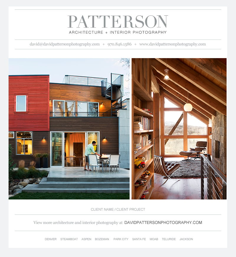
A few months later, after implementing the new logo on his site, David was ready to create some email promos. Since I was already familiar with his work, it was easy to jump in and design a stylish emailer template that fit his style and audience. Our photo editor, Jared Gruenwald, then helped with image selection. You can see the final emailer here:

Overall, I couldn’t have asked for a better outcome. The projects were enjoyable, and David and I were both happy with the results. David was kind enough to provide some feedback on his experience:
A lot has changed in the market in the last few years and I was interested in rebranding myself. I had been busy for years, but was looking for the opportunity to change things up.
I met Kayleen at an event in Denver and asked if she and the Wonderful Machine team could look at my branding and marketing. After reviewing my existing materials, she suggested starting with my logo, so Amanda got in touch. I really enjoyed the collaborative process of working with her. The design process was fun and insightful. After some discussion and a review of my old materials, Amanda created mockups that all had elements I thought worked. She then took those elements and created more; the experience was one of discovery.
Kayleen and Amanda were wise to suggest starting with the logo, it became the anchor for all my marketing collateral.
Further Reading
Wonderful Machine: Emailer Template: Tina Boyadjieva
Wonderful Machine: Logo Design: Heather Perry
Wonderful Machine: Expert Advice: Photographer Logos
Need help with your Design? Reach out!